

An AI layer can be fast, available and error-free while it quietly gets worse. Here’s how we watch the part of our system that makes judgment calls with Grafana, the logs we already write and the database we already run.
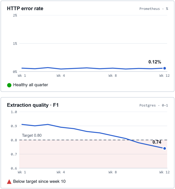
LLM monitoring in production has to measure whether the answers are right, alongside whether the system is running. Uptime, latency and error panels can stay green for weeks while output quality drops below target. At IWConnect, we track all of it in three layers on the Grafana, Prometheus, Loki and PostgreSQL stack we already run.
Traditional software fails loudly. A database goes down, requests time out, an exception fires and somebody gets paged. Most of our monitoring instincts, and most of our tooling, assume failure looks like that: a spike, a red panel, an alert.
An AI component fails politely. It returns 200 OK. It answers in under a second. It hands back well-formed JSON with every field filled in.
And the content is wrong: a technology the job post never mentioned, an industry that doesn’t fit, a confident paragraph built on the wrong evidence. Nothing errored, so nothing alerted. Google’s SRE book files this under implicit errors: a 200 response with the wrong content.
This post shows a practical way to close that gap: seeing what an AI layer inside an ordinary system is doing, at each stage of a project, with tools you probably already run. We’ll use one of our own systems as the running example.
What is an AI-inclusive system?
An AI-inclusive system is an ordinary system with one or two model steps inside it. Most AI in production doesn’t look like a chatbot. It looks like scheduled jobs, an API, a database and a CRM integration, plus a step where a model does something a rule couldn’t: read unstructured text, classify it, find something relevant, write a first draft.
We call these AI-inclusive systems because the AI is one component of the product. That shape matters for observability. The deterministic parts around the model are usually well instrumented already: you know when the scheduler fired, how long the API took, whether the database answered. The model step in the middle is the blind spot, and it’s the one step that can be wrong while everything around it is right.
What should LLM monitoring in production measure?
LLM monitoring in production should answer three questions: is it running, is it doing the work, and is the work any good? Monitoring a traditional service mostly answers the first. An AI-inclusive system needs the other two, and each one catches failures the previous one structurally can’t see.
| QUESTION | WATCHES | CAN’T SEE | CAUGHT BY |
| LAYER 1 Is it running? | • Request rate and p95 latency • Error rate • Error logs | A job that finishes successfully having done nothing. Answers that are fast and wrong. | Layer 2 |
| LAYER 2 Is it doing the work? | • Records in, out and failed per run • Batch time against its budget • Time since the last evaluation | Whether the output it counted is actually correct. | Layer 3 |
| LAYER 3 Is the work any good? | • Quality scores over time • Invented versus missed answers • Pass rate against a threshold | A yardstick that is itself wrong. Judges and test sets drift too. | Human review |
Each layer’s blind spot is exactly what the next layer measures. The last blind spot, a yardstick that’s wrong, is why people stay in the loop.
The layers depend on each other in both directions. A quality chart means nothing if the evaluation job stopped writing three weeks ago: its last point just sits there, looking fine. A throughput chart means nothing if the service is down.
You need all three eventually. You don’t need all three on day one.
What should you monitor at each phase of an AI project?
The question you’re trying to answer changes as a project matures, and so does the right amount of monitoring. Over-instrument a prototype and you’ve built dashboards for an idea you may throw away next week. Under-instrument production and you hear about the problem from a customer.
Observability isn’t something you bolt on at the end.
| PHASE | WHAT’S HAPPENING | WATCH | WITHOUT IT |
| PHASE 1 Explore “Can this work at all?” | Prompts change by the hour, and nobody depends on the output yet. | Individual traces (every prompt, response, token count and latency) plus a small hand-checked sample. Not dashboards yet. | Decisions get made on the three outputs someone happened to look at. |
| PHASE 2 Build “Is it good enough, and did my last change help?” | The approach is chosen. You’re tuning prompts, training models and getting ready to ship. | Offline evaluation against a ground-truth dataset on every meaningful change, and experiment tracking for training runs. This is where a training dashboard earns its place. | A regression ships even though you had the data to catch it. |
| PHASE 3 Run MOST OFTEN UNDER-BUILT “Is it still good, today?” | Real traffic, real consequences, and inputs that drift away from anything in your test set. | All three layers: system health, throughput and freshness, and continuous quality evaluation on live output. This is where a production quality dashboard earns its place. | Quality degrades for weeks before anyone notices. |
| PHASE 4 Evolve “Should we change it, and is the replacement keeping up?” | It works. Now you’re weighing a cheaper model, a trained classifier instead of an LLM call, or a new prompt. | The current and candidate approaches side by side, on the same traffic, graded by the same yardstick. | Swaps get decided on public benchmarks instead of evidence from your own data. |
The observability question changes with the phase, so the dashboards do too. Most teams build phase 2 and the system-health half of phase 3, and skip the rest of phase 3.
The expensive gap is almost always between phases 2 and 3. Teams invest in offline evaluation because it’s satisfying, and in uptime monitoring because it’s familiar. What gets skipped is the step in between: measuring quality continuously once the system is live.
A golden dataset tells you the model was good on the day you measured it. Only production tells you whether it still is.
How do you monitor an LLM in production with tools you already run?
For most AI-inclusive systems, the boring version is enough: Grafana on top of the metrics, logs and database you already run. The instinct, when you hear “AI observability”, is to go shopping for a platform. Hold off until you’ve tried the boring version, which lives right next to the monitoring you already trust.
- Evaluation results are just rows. A quality score is a timestamp, a record, a judge, a metric and a value. Write it to a table in the database you already run, and Grafana can chart it with plain SQL. No new infrastructure, no new vendor, and the history stays queryable forever.
- Put all three layers in one place. Grafana reads Prometheus for request metrics, Loki for logs and PostgreSQL for evaluation tables, and a JSON datasource plugin such as Infinity can pull training metrics straight from an experiment tracker’s REST API. One tool, one place to look, one alerting setup.
- Log facts at the boundary of the AI step. For every run, record what went in (how many records, from which time window), what came out (how many succeeded, how many failed), how long it took and how many model calls had to be retried. Emit them as structured fields rather than sentences, with a correlation id that follows one record through every step. That single habit turns “the job ran” into “the job ran and processed 0 of 0 records”, which is a very different sentence.
- Give silence its own panel. An error-rate panel can’t alert on nothing happening. A “time since last evaluation” panel can. It’s the only panel on the board that turns red when the system goes quiet.
- Build the panel before the data exists. A query that returns no rows today renders as “No data” and lights up the moment rows arrive. Building it early costs nothing, and it removes the “we’ll add monitoring once it’s live” step that never quite happens.
- Keep traces and scores separate. A per-call tracing tool (we use Langfuse) is where you debug one bad answer. A dashboard is where you notice that answers in general got worse. You want both, because they answer different questions.
What does LLM monitoring look like on a sales-outreach pipeline?
On our sales-outreach pipeline, we tap monitoring signals at the boundary of every step, from the CRM pull to human review. Every night the pipeline pulls new job postings from our CRM, works out what each company is looking for, finds the most relevant work we’ve delivered before, and drafts a short, specific email for a salesperson to review.
Three of its six steps involve a model. The other three are a data source, deterministic rules and a person. That mix is exactly what makes it AI-inclusive rather than an AI product.
| STEP | PASSES ON | IS IT DOING THE WORK? | IS IT ANY GOOD? |
| Job postings CRM, nightly | posting | Records per run | – |
| Understand LLM + classifier MODEL STEP | labels | – | Jury: LLM vs ML |
| Find evidence hybrid search MODEL STEP | matches | Evidence per post | – |
| Score & filter weights + rules | evidence | Passing threshold | – |
| Draft email LLM MODEL STEP | draft | – | Email quality |
| Human review before sending | – | – | Reviewer feedback |
| Is it running? request rate · p95 latency · error rate · logs, across every step | |||
Signals are tapped at the boundary of every step, including the last, so when quality drops, the dashboards say which step dropped it.
System layer
The system layer is the least interesting, and deliberately so. The API and scheduled jobs expose request rate, latency and errors to Prometheus and ship structured logs to Loki. Our overview dashboard is the first place anyone looks, and on a good day it’s boring.
Work layer
The work layer comes from one summary event per nightly run: how many postings were fetched, processed and failed, how long the batch took against its time budget, and how many model calls were retried. Every log line in between carries the posting’s id, so a single record can be followed from the CRM to the draft email.
Quality layer
The quality layer starts with a jury. The extracted technologies and industries are graded by an LLM-as-a-judge setup: several judge models from different providers independently check each extraction against the original posting and count what it got right, what it invented and what it missed. More than one judge matters: a single model grading another model tends to share its blind spots, while judges from different providers average them out. Every score lands in a warehouse table, one row per posting, per judge, per field.
Separate training and production dashboards
Training and production get separate dashboards. We also run a trained classifier that predicts the same labels from an embedding of the posting: faster and cheaper than an LLM call, if it’s good enough.
The training dashboard reads the experiment tracker and answers is each training run better than the last? The production dashboard reads the warehouse and answers is the deployed model still good on tonight’s postings?
Different questions, different cadences, often different people. Merging them would blur both.
One yardstick for both approaches
Because the classifier is graded by the same jury as the LLM, the two share a chart. That turns “is the classifier good?”, a question with no natural answer, into “is it keeping pace with the LLM?”, which has a clear one. It also tells us, with our own data, when a swap would be safe.
Why isn’t one quality score enough?
A single blended number such as F1 is a fine headline and a poor diagnosis. It hides what kind of mistake the model is making. In a pipeline that ends in an email to a real prospect, the two kinds have very different consequences.
Two models scored on the same 630 true labels. Both reach F1 0.79. Model A misses opportunities; Model B embarrasses you in front of a prospect, and the fix for each is different.
That’s why our production quality dashboard puts true positives, false positives and false negatives right next to the F1 trend. The trend tells you whether to look. The breakdown tells you what to fix.
What should a starter LLM monitoring dashboard include?
A starter LLM monitoring dashboard needs twelve panels in three rows, one row per question and four panels each. If you’re starting from nothing, this is the dashboard we’d build first. Every panel is a query against tools you likely already run.
| PANEL | TYPE | WHY IT’S THERE |
| Is it running? Prometheus · Loki | ||
| Request rate | Time series · Prometheus | Context for everything else. A drop to zero is its own incident. |
| Error rate | Time series · Prometheus | The panel everyone already has. Keep it. Just don’t stop here. |
| p95 latency | Time series · Prometheus | Model calls dominate latency; a jump often points at a provider. |
| Error logs | Logs · Loki | Structured and filterable, with a record id on every line. |
| Is it doing the work? Loki · PostgreSQL | ||
| Records per run | Bar chart · Loki | Processed and failed, per run. A bar at zero is an incident. |
| Batch duration | Time series · Loki | Drawn against its budget: the time before the next job needs the output. |
| Model-call retries | Time series · Loki | Retries climb before failures do. |
| Since last evaluation | Stat · PostgreSQL | Turns red when nothing happens. The only panel that can. |
| Is the work any good? PostgreSQL | ||
| Quality trend | Time series · PostgreSQL | F1 per task over time, with the target drawn in. |
| Invented vs missed | Bar gauge · PostgreSQL | False positives and false negatives. Same score, different fix. |
| Pass rate | Stat · PostgreSQL | Share of this week’s outputs that cleared the threshold. |
| Reviewer feedback | Time series · PostgreSQL | The ground truth no automated judge replaces. |
Row order mirrors the order you’ll investigate an incident in: is it up, is it working, is it right.
One more habit makes every panel above more useful: annotate deploys, prompt changes and model versions directly on the charts. Most quality questions start with “what changed?”, and an annotation answers it before anyone opens a log.
Do you need a new platform for LLM monitoring in production?
None of this required a new platform. It took two more questions asked of a system we were already monitoring (is it doing the work, and is the work any good?) and a few panels for each, in a tool we already had open.
That’s the part worth taking away. The instinct you already apply to infrastructure (watch it, baseline it, alert when it drifts) works one layer up, on the thing your infrastructure exists to produce.
Start in the phase you’re in. Log what your jobs did, not only that they finished. Give silence a panel.
And when every dashboard is green, make sure one of them is measuring whether the answers are right.
Want a second pair of eyes on how your own AI layer is monitored? Talk to our team and we’ll start with the phase you’re in.
FREQUENTLY ASKED QUESTIONS
What’s the difference between LLM monitoring and LLM observability?
Monitoring tells you that something changed; observability lets you work out why. Dashboards and alerts on known signals, such as error rate or a quality trend, are monitoring. Per-call traces, structured logs and a correlation id on every record are what make the system observable, because they let you follow one bad answer back through every step.
How often should you evaluate LLM output in production?
Evaluate at the same cadence the system produces output. For a nightly batch like ours, that means grading each night’s postings before the next run starts. Then alert on a “time since last evaluation” panel when it passes one cycle, so a stalled evaluation job can’t hide behind a flat, healthy-looking quality line.
Can you monitor LLM quality without ground-truth labels?
Yes, if you grade outputs against their own inputs. Our jury checks each extraction against the original posting and counts what it got right, invented or missed, so no pre-labeled answer is needed. Reviewer feedback then acts as the ground truth that audits the judges, because judges and test sets drift too.
Does the same approach work for RAG and agent pipelines?
Yes, because retrieval steps and agent tool calls are more boundaries to tap. For retrieval, track how much evidence comes back per item and have the jury grade its relevance. For agents in production, log each tool call as a step with the same correlation id, so one bad outcome can be traced to the call that caused it.