
Introduction
In this blog post, we want to present to you the power of React.js with Tailwind CSS. Any senior php engineer has been using this combination a lot to create beautiful and powerful UIs and fully functional web applications. To see this combo in action, we will create a fully functional accordion component that we have built for one recent project. Why have we used a React Tailwind accordion accordion in that project? The project is generally used by older people, therefore they need something simple but functional, so they can navigate through the process of creating the events. With this simple and powerful accordion Tailwind component and accordion component React, we have allowed them to do whatever they want.
Why Tailwind CSS over Bootstrap
Tailwind CSS is used for creating websites fast and easily. It is a utility-first CSS framework for building custom user interfaces rapidly. It is a highly customizable, low-level CSS framework that gives you all of the building blocks you need to build bespoke designs without any annoying opinionated styles you have to fight to override.
The beauty of this thing called tailwind is it doesn’t impose design specifications or how your site should look like, you simply bring tiny components together to construct a unique user interface. What Tailwind simply does is take a ‘raw’ CSS file, process this CSS file over a configuration file, and produce an output.
Why Tailwind CSS?
- Faster UI building process and Tailwind UI accordion
- It is a utility-first CSS framework meaning we can use utility classes to build custom designs without writing CSS as in the traditional approach.
But before we see why accordion in Tailwind CSS, first, let’s create React app with the command ‘npx create-react-app accordion’. After that, you will need to make just a few steps to configure tailwind to work with our app. Just follow the steps on this link: https://tailwindcss.com/docs/guides/create-react-app.
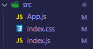
After you configure your project, delete all files from the src folder that you do not need. Your src folder should look like this:
Your index.js file should look like this:
import React from 'react';
import ReactDOM from 'react-dom';
import './index.css';
import App from './App';

ReactDOM.render(<App />, document.getElementById('root'));
And your App.js file should look like this:
import React from 'react';

const App = () => {
  return (
    <div >

    </div>
  );
};

export default App;
As we have said, we delete everything that we do not need so we have a clean folder structure.
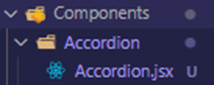
Next, we will create the Components folder and their Accordion folder with the Accordion.jsx file.
That should look like this:
Your Accordion.jsx file for start should have this code:
import React from 'react';

const Accordion = () => {
  return (
      <div>
          Accordion Component
      </div>
  );
};

export default Accordion;
Now go in the App.js file and import our new Accordion component.
App.js file:
import React from 'react';

import Accordion from './Components/Accordion/Accordion';

const App = () => {
  return (
    <div >
      <Accordion />
    </div>
  );
};

export default App;
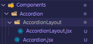
Next, we need to create AccordionLayout folder in the Tailwind Accordion folder and AccordionLayout.jsx file in our AccordionLayout folder, which should look like this:
Your AccordionLayout.jsx file should look like this:
import React from 'react';

const AccordionLayout = () => {
  return (
      <div>

      </div>
  );
};

export default AccordionLayout;
Now we need to create a reusable layout for our accordions.
First, we will create the form for our accordion and we will style it with help of Tailwind CSS.
AccordionLayout.jsx file now:
import React from 'react';

const AccordionLayout = ({ title }) => {
  return (
    <>
        <div className='flex justify-between p-2 mt-2 rounded bg-green-400'>
            <div className='flex'>
                <div className='text-white font-bold'>{title}</div>
            </div>
        </div>
    </>
  );
};

export default AccordionLayout;
As you can see, through the props we will accept the title for our accordion and we will display it.
Next, we will need to install a library for icons, so we can display arrows on our React accordion. Run this command in your terminal: ‘npm I react-icons’.
After that, we need to import 2 icons and use them.
AccordionLayout.jsx file:
import React from 'react';

import { BsFillArrowDownCircleFill, BsFillArrowUpCircleFill } from 'react-icons/bs'

const AccordionLayout = ({ title, children }) => {
  return (
    <>
        <div className='flex w-1/2 justify-between p-2 mt-2 rounded bg-green-400'>
            <div className='flex'>
                <div className='text-white font-bold'>{title}</div>
            </div>
            <div className="flex items-center justify-center">
                <BsFillArrowUpCircleFill className='w-8 h-8' />
            </div>
        </div>
        <div className="shadow-3xl rounded-2xl shadow-cyan-500/50 p-4 mb-6">
            {children}
        </div>
    </>
  );
};

export default AccordionLayout;
For now, we will just display one static icon, but later we will make it fully functional.
Now let’s use this AccordionLayout. We need to import it and give it some HTML to be displayed as children’s property.
Accordion.jsx file:
import React from 'react';
import AccordionLayout from './AccordionLayout/AccordionLayout';

const Accordion = () => {
  return (
      <div className='flex flex-col justify-center items-center'>
          <AccordionLayout title="Accordion 1">
            This is Accordion 1 Content
          </AccordionLayout>

          <AccordionLayout title="Accordion 2">
            This is Accordion 2 Content
          </AccordionLayout>
      </div>
  );
};

export default Accordion;
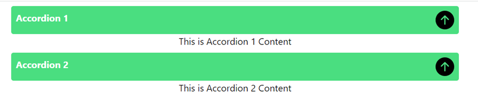
Now on your screen, you should have something like this:
Until now we are doing great. But this is just static HTML, we need to make it dynamic so that accordions can be opened and closed. For that, we will use react hooks. Let’s get in action.
First, we will need to create one state in our Accordion.jsx file.
Something like this:
const [activeIndex, setActiveIndex] = useState(1); Do not forget to import useState from React:
import React, { useState } from 'react';With the help of this index state, we will track which accordion needs to be open or closed.
The next step is to send the index state into AccordionLayout.
Accordion.jsx file:
import React, { useState } from 'react';
import AccordionLayout from './AccordionLayout/AccordionLayout';

const Accordion = () => {
    const [activeIndex, setActiveIndex] = useState(1);

  return (
      <div className='flex flex-col justify-center items-center'>
          <AccordionLayout
            title="Accordion 1"
            index={1}
            activeIndex={activeIndex}
            setActiveIndex={setActiveIndex}
          >
            This is Accordion 1 Content
          </AccordionLayout>

          <AccordionLayout
            title="Accordion 2"
            index={2}
            activeIndex={activeIndex}
            setActiveIndex={setActiveIndex}
          >
            This is Accordion 2 Content
          </AccordionLayout>
      </div>
  );
};
export default Accordion;
Now let’s explain this. Through index property we are telling the AccordionLayout on which index our accordion should be, therefore first Accordion will have index={1} and second index={2}.
ActiveIndex at the start will be 1, therefore our first accordion will be open at the starting point of our application.
That’s it for now in the Accordion.jsx file, now we need to create logic in AccordionLayout.jsx file.
AccordionLayout.jsx file:
import React from 'react';

import { BsFillArrowDownCircleFill, BsFillArrowUpCircleFill } from 'react-icons/bs'

const AccordionLayout = ({ title, children, index, activeIndex, setActiveIndex }) => {
  return (
    <>
        <div className='flex w-1/2 justify-between p-2 mt-2 rounded bg-green-400'>
            <div className='flex'>
                <div className='text-white font-bold'>{title}</div>
            </div>
            <div className="flex items-center justify-center">
                <BsFillArrowUpCircleFill className='w-8 h-8' />
            </div>
        </div>

        {(activeIndex === index) && (
            <div className="shadow-3xl rounded-2xl shadow-cyan-500/50 p-4 mb-6">
              {children}
            </div>
        )}
    </>
  );
};

export default AccordionLayout;
Now we are just accepting the props and using them to create some logic. This means if the activeindex is equal to the index then display that accordion content, if not then do nothing.
And because our activeIndex = 1 that means that the first accordion will be open and the second accordion closed. If we manually change the activeindex = 2, then the second accordion will be open.
Of course, we cannot do it always manually, so we need to create logic for it when the user clicks on the accordion to open it, if it is already open then close it and open the other one. Let’s make it through the code.
AccordionLayout.jsx file:
import React from 'react';

import { BsFillArrowDownCircleFill, BsFillArrowUpCircleFill } from 'react-icons/bs'

const AccordionLayout = ({ title, children, index, activeIndex, setActiveIndex }) => {
  const handleSetIndex = (index) => (activeIndex !== index) && setActiveIndex(index);

  return (
    <>
        <div onClick={() => handleSetIndex(index)} className='flex w-1/2 justify-between p-2 mt-2 rounded bg-green-400'>
            <div className='flex'>
                <div className='text-white font-bold'>{title}</div>
            </div>
            <div className="flex items-center justify-center">
                <BsFillArrowUpCircleFill className='w-8 h-8' />
            </div>
        </div>

        {(activeIndex === index) && (
            <div className="shadow-3xl rounded-2xl shadow-cyan-500/50 p-4 mb-6">
              {children}
            </div>
        )}
    </>
  );
};

export default AccordionLayout;
As you can see, we are doing it with just 2 lines of code, first, we create a function and second, we call it on click.
What does this line function do? First, it accepts the index in the props and then checks if activeIndex is not equal to the index that is sent through the props, if it is not equal that means that we try to open a different accordion from what is open. If that is not the case that means that we click on the same accordion so we do nothing.
The last thing that we need to do is to change the icon if the Tailwind React accordion is open.
We will do that very easily.
AccordionLayout.jsx file:
import React from 'react';

import { BsFillArrowDownCircleFill, BsFillArrowUpCircleFill } from 'react-icons/bs'

const AccordionLayout = ({ title, children, index, activeIndex, setActiveIndex }) => {
  const handleSetIndex = (index) => (activeIndex !== index) && setActiveIndex(index);

  return (
    <>
        <div onClick={() => handleSetIndex(index)} className='flex w-1/2 justify-between p-2 mt-2 rounded bg-green-400'>
            <div className='flex'>
                <div className='text-white font-bold'>{title}</div>
            </div>
            <div className="flex items-center justify-center">
                {
                (activeIndex === index)
                ? <BsFillArrowDownCircleFill className='w-8 h-8' />
                : <BsFillArrowUpCircleFill className='w-8 h-8' />
                }
            </div>
        </div>

        {(activeIndex === index) && (
            <div className="shadow-3xl rounded-2xl shadow-cyan-500/50 p-4 mb-6">
              {children}
            </div>
        )}
    </>
  );
};

export default AccordionLayout;
Explanation: we are just checking if the accordion is open then the arrow is shown down, if not the arrow is shown up.
Conclusion
Congratulations! You have successfully created the fully functional accordion with React and accordion with Tailwind. We have seen how much power this Tailwind accordion React combo has. We encourage you to try this out in your next project and make the best out of the accordion Tailwind React benefits!
GitHub Repo for this project: https://github.com/HristijanGjorgjioski/Accordion-Component-Blog