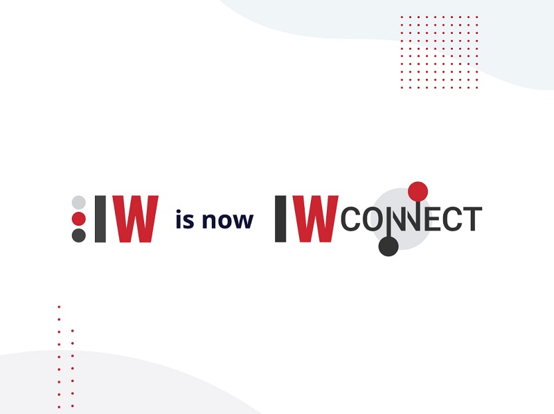
A brand is more than just a word; it represents a sense of belonging to a group of people who share the same values, opinions, and goals. Building a brand takes time and effort to bring people together and create a cohesive story. Since 2004, the ⋮IW brand has grown and evolved. Recently, ⋮IW rebranded itself as ⋮IWConnect – We connect the DOTS to unleash your business potential. Here, we explain why we decided to rebrand, the story behind our new name and logo, and our brand promise.
Why Behind the Re-branding
We have been in the market since 2004, during which time we have changed and grown immensely. We experienced many things internally and externally – happy and sad moments, two global crises, significant expansion, and technological changes. As the world changes, we adapt and grow. We’ve expanded our technology and expertise portfolios, opened offices domestically and internationally, and realized that this growth warranted a rebranding. This included a new name, logo, and website to better communicate ⋮IWConnect’s story and brand. With the rebranding, we realigned our mission, vision, core values, and belief system to ensure we continue providing exceptional value.
The Story behind ⋮IWConnect and the logo
When talking about the name, we believe that a name can make a significant difference, and most importantly it should describe the company in its entirety. To better understand the need to change the name, we will go a bit back to the history of our name. At the same beginning in 2004, the name of our company was InterSoft Consulting meaning International Software Consulting. Soon afterward, we changed it to InterWorks meaning International Consulting/Partnership that Works. Up until this year, the name described us perfectly, but with the changes throughout the years (15 Years in Review; Chapter 16 of ⋮IW’s Story – 2020 at ⋮IW) and the great expansion, we have realized that we aren’t only International Consulting/Partnership that Works, but we are more than that. Internally, we are a multidisciplinary team that connects knowledge, skills, and expertise to create business solutions, and then connects those solutions to deliver exceptional value to our clients.
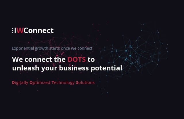
We also connect on a personal level as friends and family. With clients, we connect with them as if they are part of our team. Considering our significant expansion in technologies, solutions, countries, projects, and clients, changing the name to ⋮IWConnect felt natural. The future is all about connectivity and digitalization, and we have been connecting the DOTS (Digitally Optimized Technology Solutions) since 2004.
Our new name consists of ⋮IW and Connect, written jointly. This semantically describes all the connections we have discussed and visually represents our brand. The three dots and IW remind us of our roots and tradition, while the word Connect refreshes our brand and reflects our future. Thus, we connect history and tradition with the future by connecting the dots in the present.
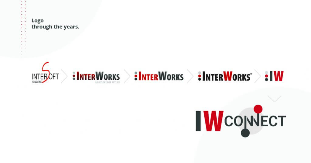
Our chosen colors – black, gray, and red – represent boldness, passion, energy, security, and reliability. They symbolize our resilience and desire to do more and be more, even during crises. We have remained steadfast in providing exemplary customer services that empower clients to unleash their full business potential, even during the global financial crisis in 2007 and the ongoing COVID-19 crisis.
The Idea behind We connect the dots to unleash your business potential
We believe people and businesses have the potential to achieve things they may not realize they can. Often, we stop if something seems too difficult, but nothing is unachievable with determination and a firm goal. Afterward, you just connect the dots. Our premise is that our clients are the Business Experts, and we are the IT experts. When we connect our intentions and vision, we set the stage for exponential growth that will unleash our clients’ business potential. Success starts once we connect and depends on the connection we establish.
⋮IWConnect brand promise
Our daily work involves connecting with our clients, understanding their challenges, and helping them focus on growth. The rebranding doesn’t change our brand promise: Our clients are part of the ⋮IWConnect family. We share the same opinions, ideas, desires, and fears, and we are focused on creating outstanding value that provides a competitive advantage and ensures our clients unleash their business potential.
The future is ours – let’s connect and unleash the potential that we all have.
Check out the official video of the re-branding: