
Why do we need Data Mining?
Nowadays there is a huge amount of data available everywhere, the only concern is how to utilize this data to generate some sort of knowledge that can be used for decision making. Data mining is the answer.
Data mining discovers hidden patterns of the already available data, extracts knowledge from that data and establishes relationships to solve problems through data analysis. Different techniques of data mining can help companies increase their effectiveness and profit.
Orange (tool)
Orange is component-based visual programming software for data mining, machine learning, and data analysis. Workflows are created by linking predefined or user-designed components called widgets. They read the data, process it, visualize it, do clustering, build predictive models and so on.
What problems do we solve?
Every company has historical data. It is very impressive how we can predict future outcomes based on that data. In the first part, we will show a simple example of how we can predict the type of animal-based on its known characteristics.
Sometimes we are also interested in the content of some books or documentation, but we don’t have time to read the full text. For this purpose, we can use text mining and check the most represented words in it. Regarding this, we will show one more example using Text mining in Orange used for Twitter’s tweets.
Predictions in Orange
Prediction is one of the most used techniques in Data mining. Orange has a predefined widget for making predictions.
We’ll show a simple example where we use two files. But first, we will explain some terms here:
- Meta variables are metadata, data about data, not used for statistical inference.
- Features or variables or attributes are the measured inputs of the problem domain, the independent variables.
- The target variable is the dependent variable or the measure we’re trying to model or forecast.
In the first file, there are 82 instances (animals) with 16 features specified. The type will be the target role and the name will be meta role. In the second file, there are 4 instances with 16 features specified, with unknown name and type of animal.
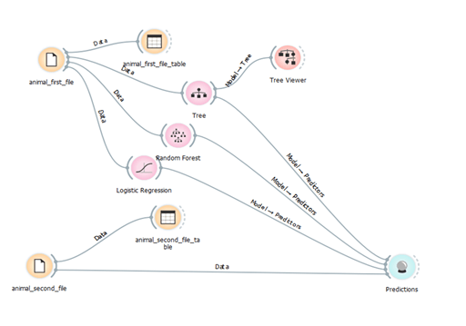
The purpose of this workflow is to make a prediction on the animal types of the second file. To make the prediction we’ll need two data sets: the training data, that is loaded from the first Datasets widget (animal_first_file) and the data to predict availability in the second Dataset widget (animal_second_file).
This workflow starts with the File widget. The data from the animal_first_file is sent to Data table, Tree, Random Forest and Logistic regression widgets. The second file which contains the test set is connected with Predictions and Data table widget.
Note: when working with machine learning algorithms, we should have in mind that the data should be analyzed, preprocessed and cleaned before we use it in the algorithm. In our example, we have a simple data set and the data is ready for the predictions.
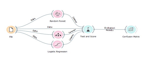
Classification is a process that can help us organize the data into categories or class labels for its most effective and efficient use. It learns from the given data and recognizes the relationship between the attributes and the labels. The challenge is to choose the best classifier for the situation, because there are many available and some of them give better results to different kinds of data than others. We will try three different classification models and test what suites best for our data set. Test and Score widget expects the data from the file and three different learning algorithms as an input. Test and Score will now use each connected Learner and the Data to build a predictive model. Models can be built in different ways. The most typical procedure is cross-validation, which splits the data into k folds and uses k-1 folds for training and the remaining fold for testing. In Figure 2 we can see how we can obtain the confusion matrix. We are using the first data set which contains 82 instances from animals and their characteristics.
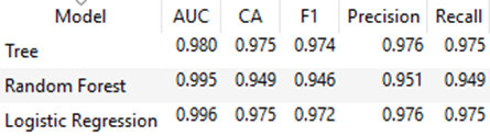
Test and score widget has values for classification accuracy (CA) that give us a proportion of correctly classified data instances. We can conclude that in this case Random Forest is less suitable than the other classification models. Also, we can see that Tree classifier and Logistic regression give us approximate accuracy and precision. In this case, we will consider the value of F1 – this value is a measure for the test’s accuracy. It considers both the precision and the recall of the test to compute the score. So, we will use the Tree classifier in our example. For this model, we can see that AUC (Area under ROC curve) has a value of 0.98 – and this is an excellent value. Even the values of AUC for the other models are better, they have worse value for F1.
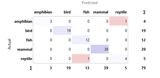
As we have classification accuracy around 97%,3% of the data, we can say that the instances are misclassified. Using the Confusion Matrix, we can observe how many instances were misclassified and in which way. Figure 4 shows the test result from the Tree classification model.
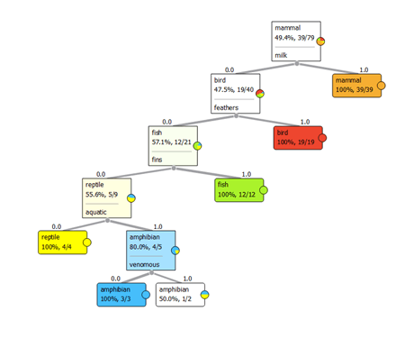
Tree classifier is a simple algorithm that splits the data into nodes by class purity. It is used to predict membership of cases or objects into classes of a categorical dependent variable from their measurements on one or more predictor variables. Tree viewer is used for 2D visualization of data from the classification tree.
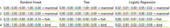
In Figure 6, we can see that we get an identical result using different algorithms – we have four animals and they are predicted in the appropriate category. But, if we analyze the predictive coefficients, we can see that using Tree classifier we have predictive coefficients equal to 1. In the text above we mentioned that we will use a tree classifier for the prediction based on the values from the test and score. And we were right! For this data set, the best algorithm for prediction (from the three algorithms chosen at the beginning) is Tree classifier.
Text mining in Orange
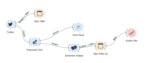
Orange has an option called add-ons, where several packages are stored. In the following example, we have used the package for Text mining. After installing the new package there is an additional widget set. Twitter widget enables querying tweets through Twitter API and allows queries for up to two weeks back.
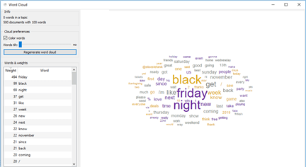
In the example above, we searched for tweets that contain the word Friday in order to make analyses for tweets related to Black Friday. After getting the tweets we preprocess them and send them to Word Cloud widget. Using this widget, we can obtain the most used words in the tweets. The most popular words in the last two weeks are black, Friday, night.
One of the most interesting analysis that can be done using Orange is Sentiment Analysis. There are two types of sentiment modules available here: Liu Hu and Vader. Liu Hu computes a single normalized score of sentiment in the text (negative score for negative sentiment, positive for positive, 0 is neutral), while Vader outputs scores for each category (positive, negative, neutral) and appends a total sentiment score called a compound.
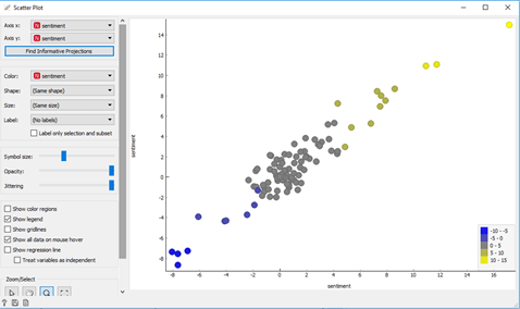
We want to know if we have positive or negative emotions in the tweets that we got by using the widget. In this example, we can use Liu Hu module. This analysis represents negative numbers for tweets with negative words, zero for neutral tweets and positive numbers for tweets with a positive sentiment. The scatter plot widget graphically shows the Sentiment Analysis. In the plot, there is a legend where we can see the values from the analysis for all the tweets that were found before. The blue dots are tweets with negative content, the gray dots are with neutral content and the yellow are tweets with positive content.
Conclusion
Data mining is used to build prediction models based on historical data. They can help in making decisions and predict future trends. Orange is a very helpful tool for data visualization and analyzing big data sets. It is open-source software that allows trying different algorithms and supports visual programming tools for Data mining. Moreover, after performing practical implementation Orange has done everything as its feature said. This tool makes analysis work easier.
If you have tried this and want to share your experience or if you want to try it, you can contact us and we can do it together.