
Once you start a business, the time begins to fly faster than before. In such busy conditions, everyone is faced with the challenge of lack of time and sometimes we move without a definite direction, which on the other side leads to stagnation or work which does not result to significant profit. Hereby we show you one example of how Tableau, a powerful BI tool can help you measure and visualize your business.
Making measurements is an important action in every long-term job. People have always engaged in measuring their progress and making a difference between good and bad business days, months or seasons.
By measuring the business we can get a picture of our business about how we do things, whether we are wandering and tapping in place or running in full steam. That’s why there is a quote that says: “If you can’t measure it, you can’t improve it”. By investing in measurement and analysis of previously collected data, we provide information and create an image that many parties benefit from:
1. Business management
Having accurate analytical information at the right time can significantly improve the way the business works through the perception of the sales, the costs and the market.
Then, perceiving the strengths and weaknesses of certain internal departments, areas, or employees would give additional answers: why, where, who and to whom to act. If it is a strong side to reward or improve, otherwise we will correct and make further efforts.
2. Motivation
If employees are given the chance to look at the progress of the business and their contribution to the same, they are increasingly investing in their work. When they have information that their productivity is lagging, they would invest more. And by measuring the success we come to a situation where they set their goals, discuss the progress and thus come up with solutions and improved productivity.
3. Information about potential buyers
As an internal benefit, business information is also important for external purposes.
A visual overview of the success of the business is an “advertisement” and gives a clear picture for potential buyers and investors about the extent of value and success of the business.
Visualizing the data with (Tableau)
The way in which the analysis is presented is also a very important element. Nowadays, using BI tools like Tableau makes it easier for us to understand the importance of the data.
The Dashboard extension for Tableau helps us to understand the strong and weak spots of the collected data in terms of usage and interaction and enables easily gathering detailed data without digging in data warehouses, servers, or huge log files.
How about geographic hits, filter usage, and mark interaction on our sheets in real time?
We’re going to show an example of examining data for a company working around the globe and we will visualize its profits and sales by countries for a period of 4 years:
1. Sales per Country
The picture below shows a sheet within the map of the world divided into Countries, with the represented countries colored in different colors depending on the sum of sales. The countries are filled according to the legend on the right side.
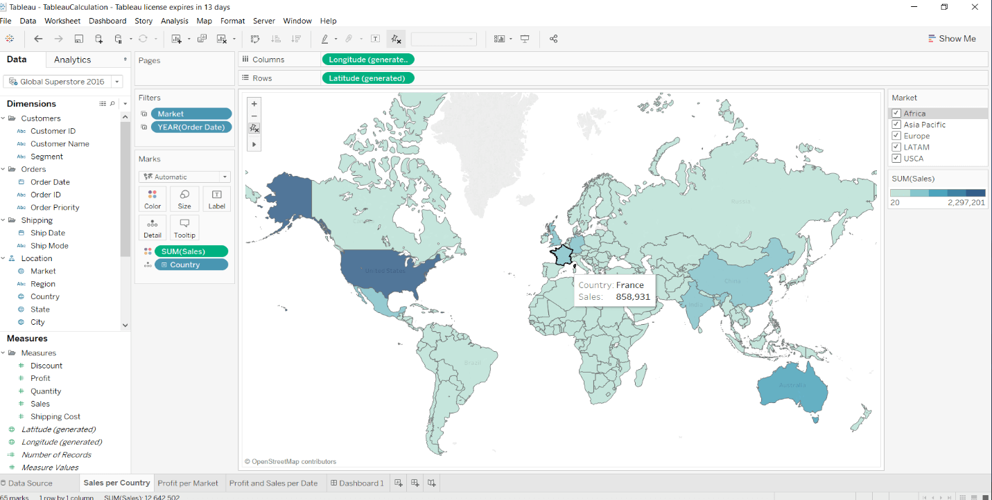
If we point at any country, the name of the country will be written together with the sum of sales for that country. Additionally, there is a filter for Continents on the right side which filters the countries by Continent.
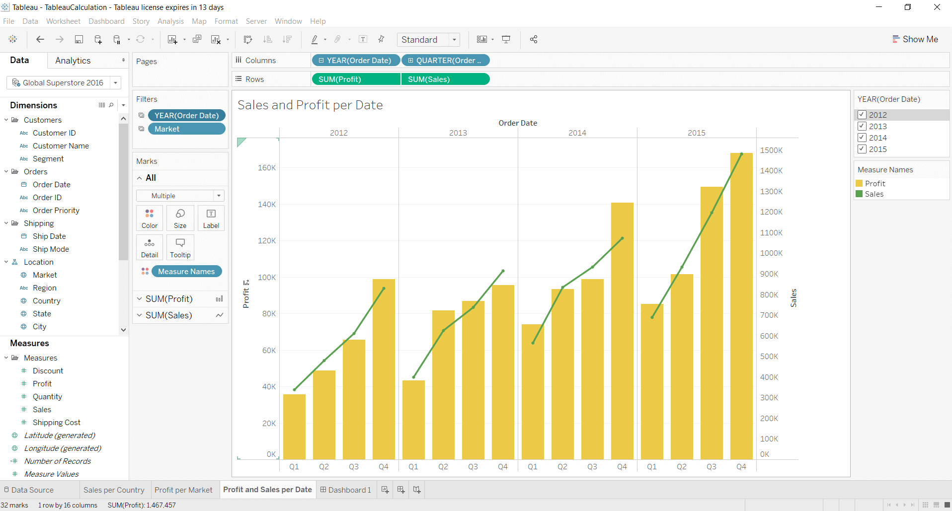
2. Profit and sales per year
Profit and sales in this sheet have been presented in a graph showing the growth of profits and sales divided into years and quarters.
3. Creating a dashboard
In order to connect these two analysis and present it, we will create an interactive Dashboard:
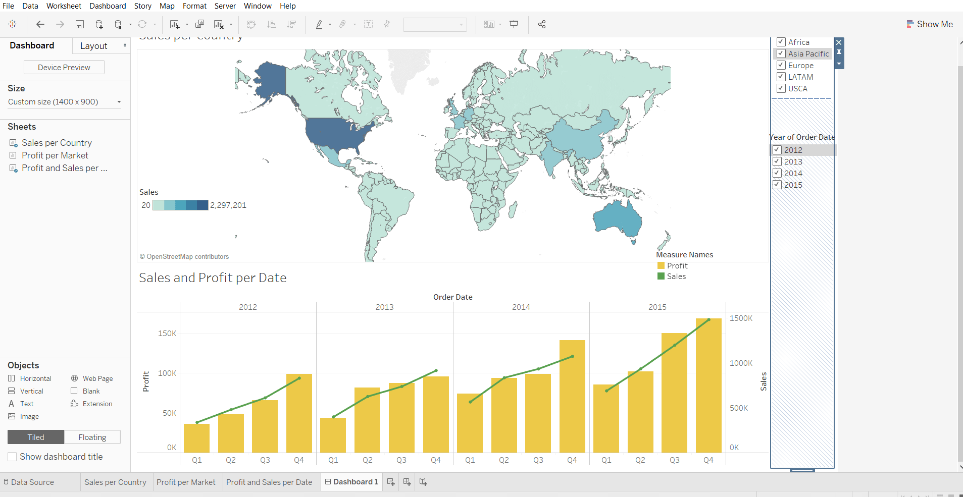
On the right side the filters option for each sheet appears. We may want to apply the filter to the dashboard:
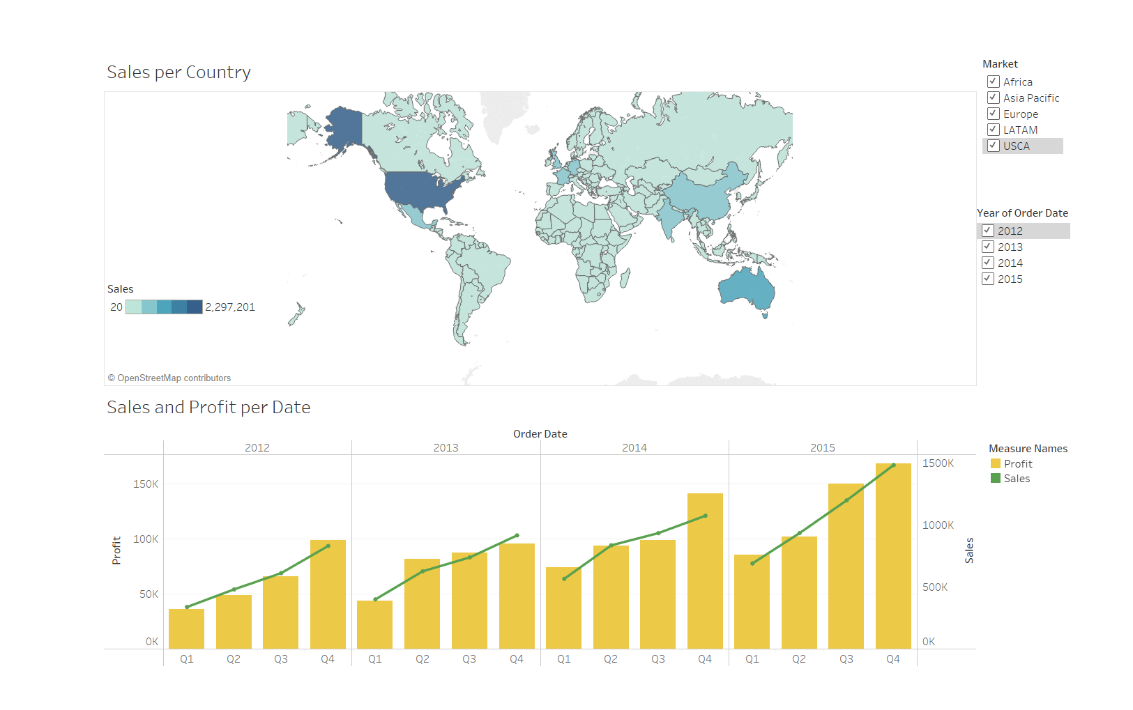
If we want to see the sales and profit for a specific continent and for a specific year, we can easily manipulate with the checkboxes as shown below:
We have represented the sales for the countries in Africa from 2013.
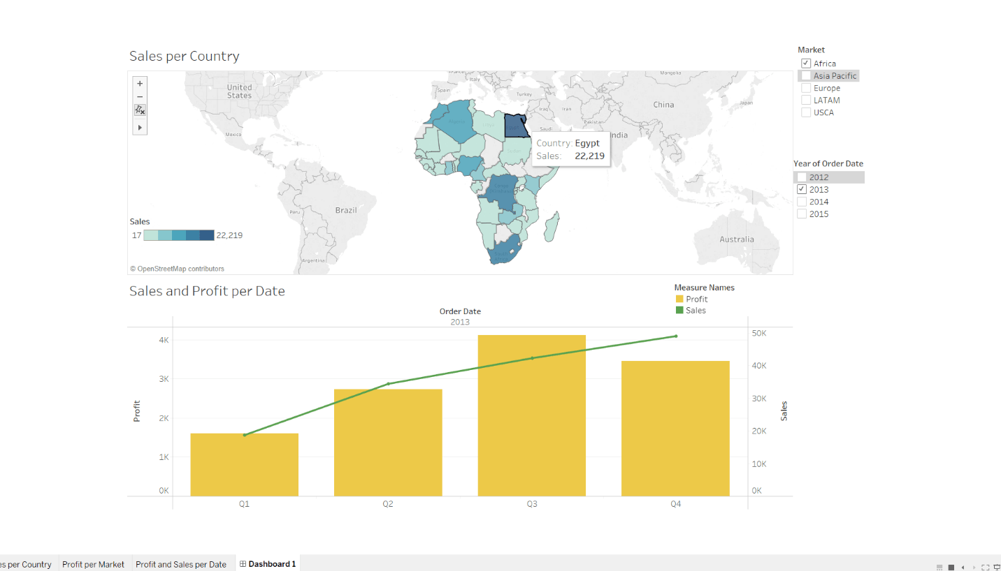
We can also see the progress of the sales and profit for the wanted year divided per quarter for that Continent.
Conclusion
For as long as business intelligence (BI) has been around, visualization tools have played an important role in helping analysts and decision-makers quickly get insights from data. Tableau allows us to step out of the box and look at data in a totally different way. This was just a simple example of one of the many powerful operations that Tableau can perform. We can make even more complex analyses, future prediction,s and visualization of our data which will help us see and understand the information you have.